How House Number Fonts Can Influence Exterior Style

Your house number may be small, but it can make a big impression. It is often one of the first things visitors notice as they approach the front door, gate, or porch. Just the right font can subtly enhance your home, but the wrong font can make it feel like it’s out of place. Whether it’s the modern, clean lettering or the traditional, adorable style, house number fonts make a significant difference in the overall look of a home’s exterior.
Choosing the right house fonts involves more than selecting a style that looks attractive on its own. The lettering should complement the home’s architecture, exterior materials, and overall color scheme while remaining easy to read from the street. Considering these elements together can help create a balanced entrance where the house numbers feel like a natural part of the property’s exterior design.
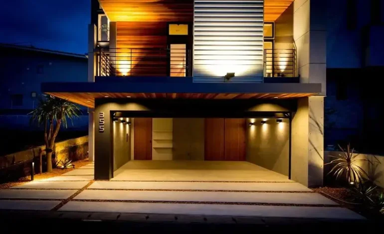
Modern Homes: Clean & Confident.
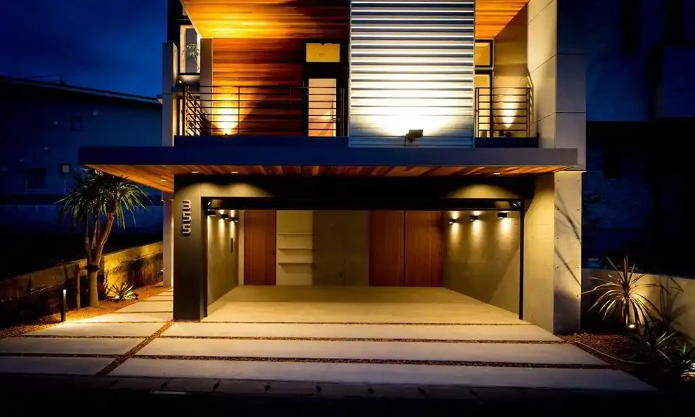
Simple fonts are great when it comes to a contemporary home. The sleek, sans-serif digits featuring clean lines can capture the sharp edges, glass surfaces and minimalist aesthetic of contemporary buildings. Use tall, thin numbers in a contrasting colour to the wall behind them. The entrance can also have a bold, geometric font which will give it a more intentional look. The combination of black numbers on a light background can make a bold, eye-catching design without seeming overstated.
Traditional Homes: A Touch of Character
Classical houses will usually look great with a slightly more personality font. The serif numbers, which have a small decorative stroke, can combine with brick facades, wooden doors, stonework and other traditional features. In a vintage or traditional home, a decorative font can evoke a sense of comfort and history. But it’s a delicate balance between elegant and too decorative. The numbers must still be readable from the street. In any case, when people have to squint to see your front door, style is irrelevant.
Farmhouse: Rustic
A rustic or farmhouse style allows more flexibility for texture and character in the home. Timber, weathered wood, stone and dark metal are all excellent choices of complementary surface materials to accentuate chunkier fonts. The entrance can be made more relaxed and welcoming through handcrafted-looking numbers. A slightly less refined or vintage font might be more at home here than a very modern font.
Remember to include scale and placement.
Selecting a font is just half the battle. Size matters, too. Small numbers can get lost against a hectic facade, and large numbers can dwarf a small door. Take note of distance from the street, background colour, and surrounding architectural features. What looks great when viewed from a short distance might not be so striking when viewed from afar.
Let the Numbers Complete the Look
House numbers are more than mere practicalities. They are one of those little details which can complete an exterior design. If the font matches the architecture, materials and personality of the home, the entrance is not a fluke, but intentional.If your property is modern and sleek, has a traditional feel, or falls somewhere in between, the right house number font can add that extra touch of elegance to your home’s exterior.